Content too wide on mobile
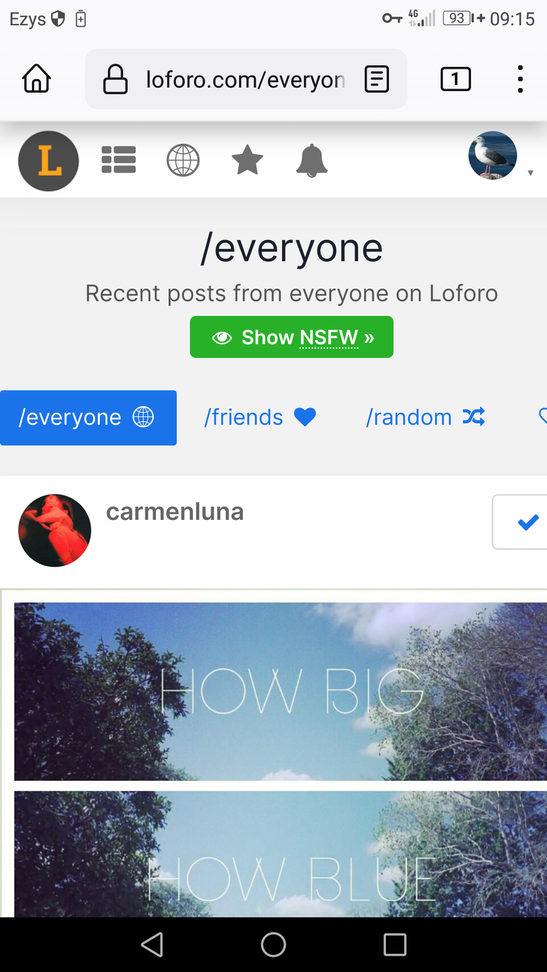
It does not fit the width of the mobile browser viewport (Mozilla Firefox Beta 118). To view everything the browser must be zoomed out.
Reposted from
Posts tagged #firefox
It does not fit the width of the mobile browser viewport (Mozilla Firefox Beta 118). To view everything the browser must be zoomed out.

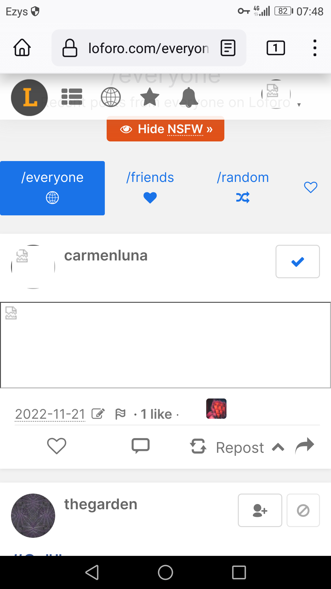
When using loforo on mobile phone I usually encounter slow connection issues where images do not load, while other sites load fine. On the desktop site works fine. Screenshot:
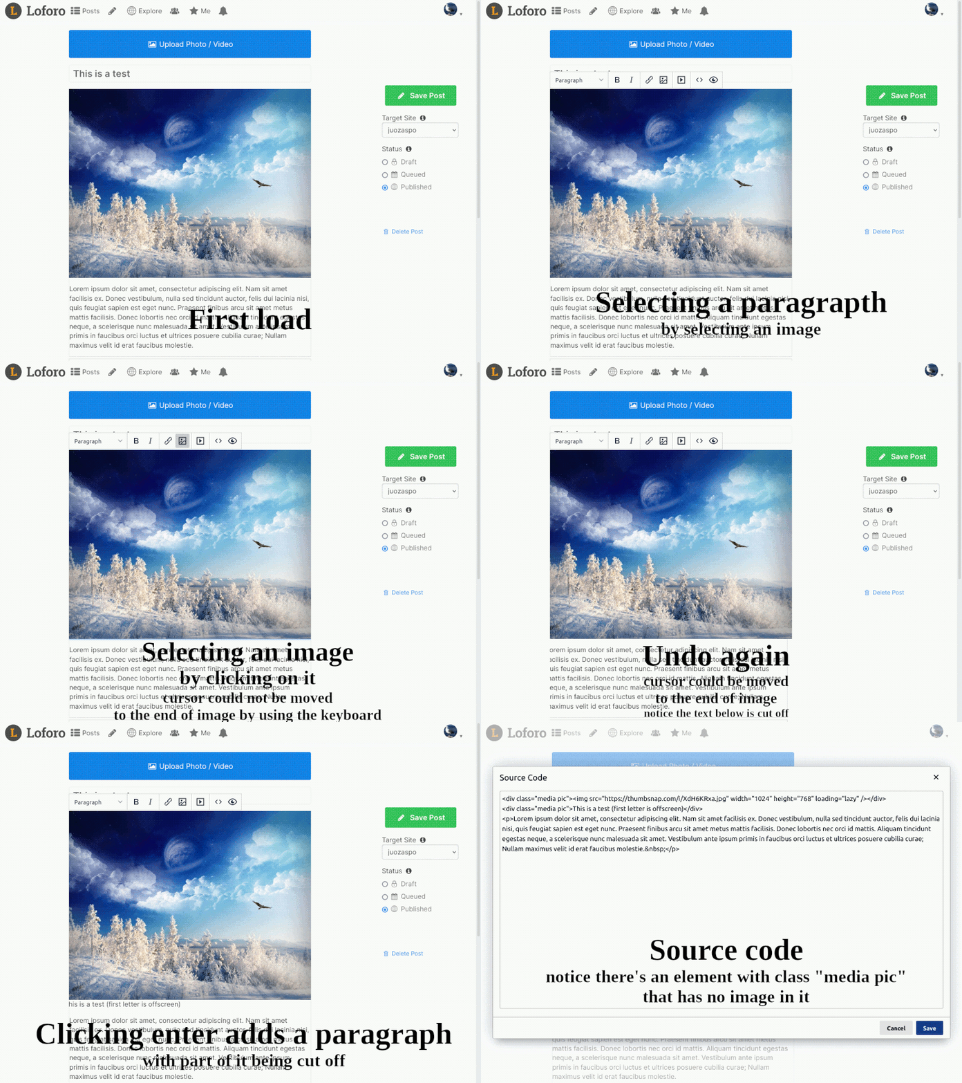
Trying to insert paragraph after image is a very problematic. Cursor must be moved after it which is not possible in normal ways. The image must be selected, paragraph before it must be inserted and undone, only then image could be moved to the place after it. The next inserted element appears incorrect as it includes a class that should not be there. Using Mozilla Firefox ESR 102. The related behavior is shown in the gif below.
I'm using Mozilla Firefox ESR 102, and I've noticed a small bug regarding image info editing. When doing that, a duplicate image is inserted instead of replacing the selected image. The behavior is shown in the gif below.

It is not needed if the browser (like the one in most of the Android phones) has it's own progress bar. Double progress bar looks surely weird :\

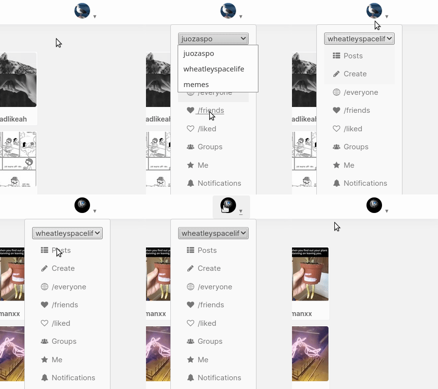
The active blog menu in the user menu popup does not work as intended. The menu closes prematurely after trying to change active blog or just opening and deselecting the menu. Stuck on curent blog unless cursor is on select box and active blog is changed using keyboard. Using Mozilla Firefox 89.0.2 on Linux
The posts don't fit to the screen, they are too wide. Using Firefox beta on Huawei NEM-L21 (Android 7.0, 1080x1920 screen resolution

The posts don't fit to the screen, they are too wide. Using Firefox beta on Huawei NEM-L21 (Android 7.0, 1080x1920 screen resolution)
